From Low-Carb to Carnivore
Simple kosher guides to help you move from low-carb, to keto, to ketovore, to carnivore without confusion.
Learn The KosherVore Path
Start flexible. Simplify when needed. Use carnivore as a reset, not a prison.
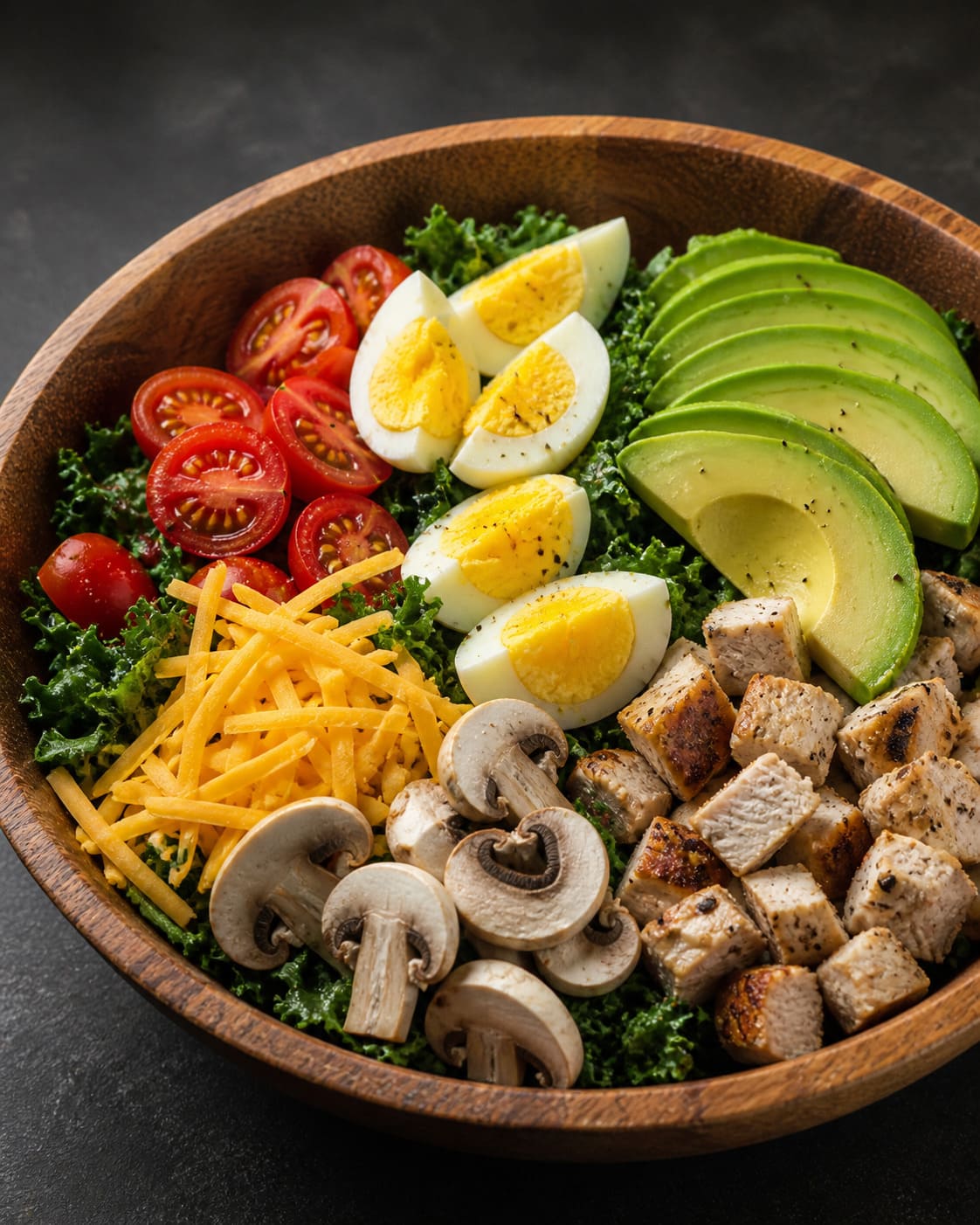
Low-Carb
The easiest place to begin. Reduce sugar, bread, pasta, rice, and starches while still keeping meals flexible and kosher.
Keto
A stricter low-carb approach focused on protein, fat, and fewer carbs while keeping meat, dairy, and fish rules clear.
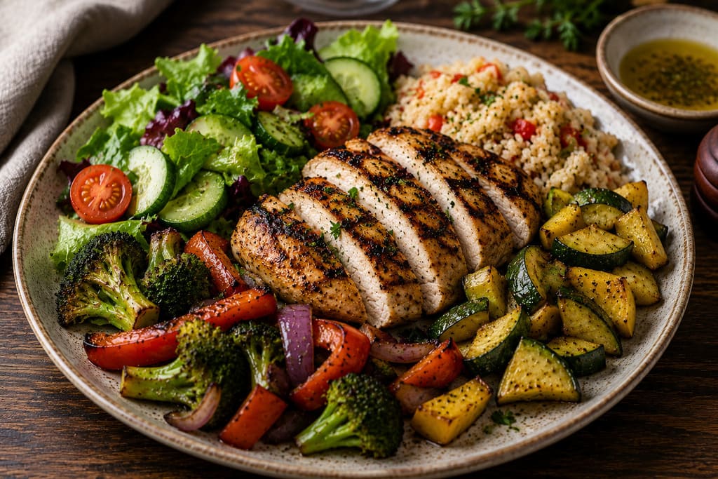
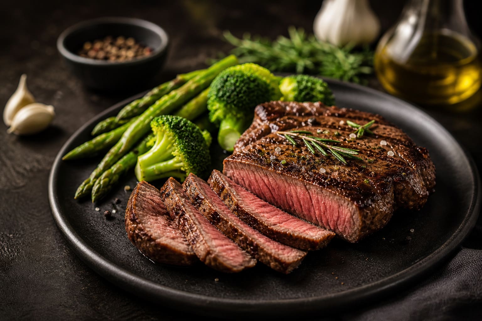
Ketovore
Meat-first eating with small low-carb extras when they help you stay consistent.
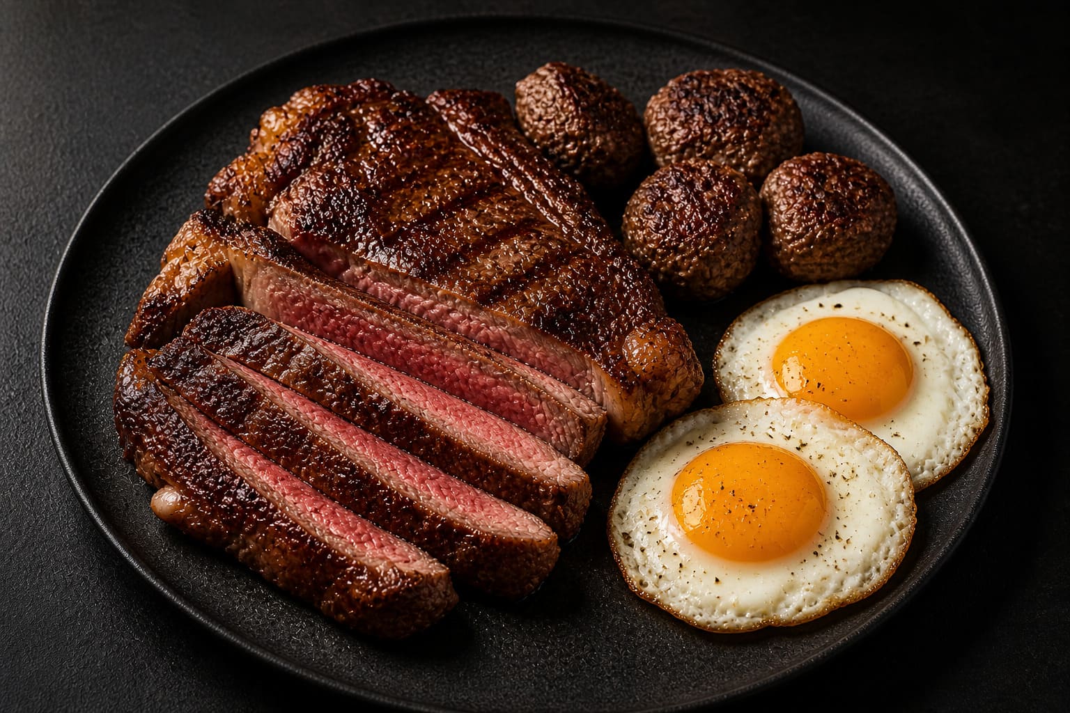
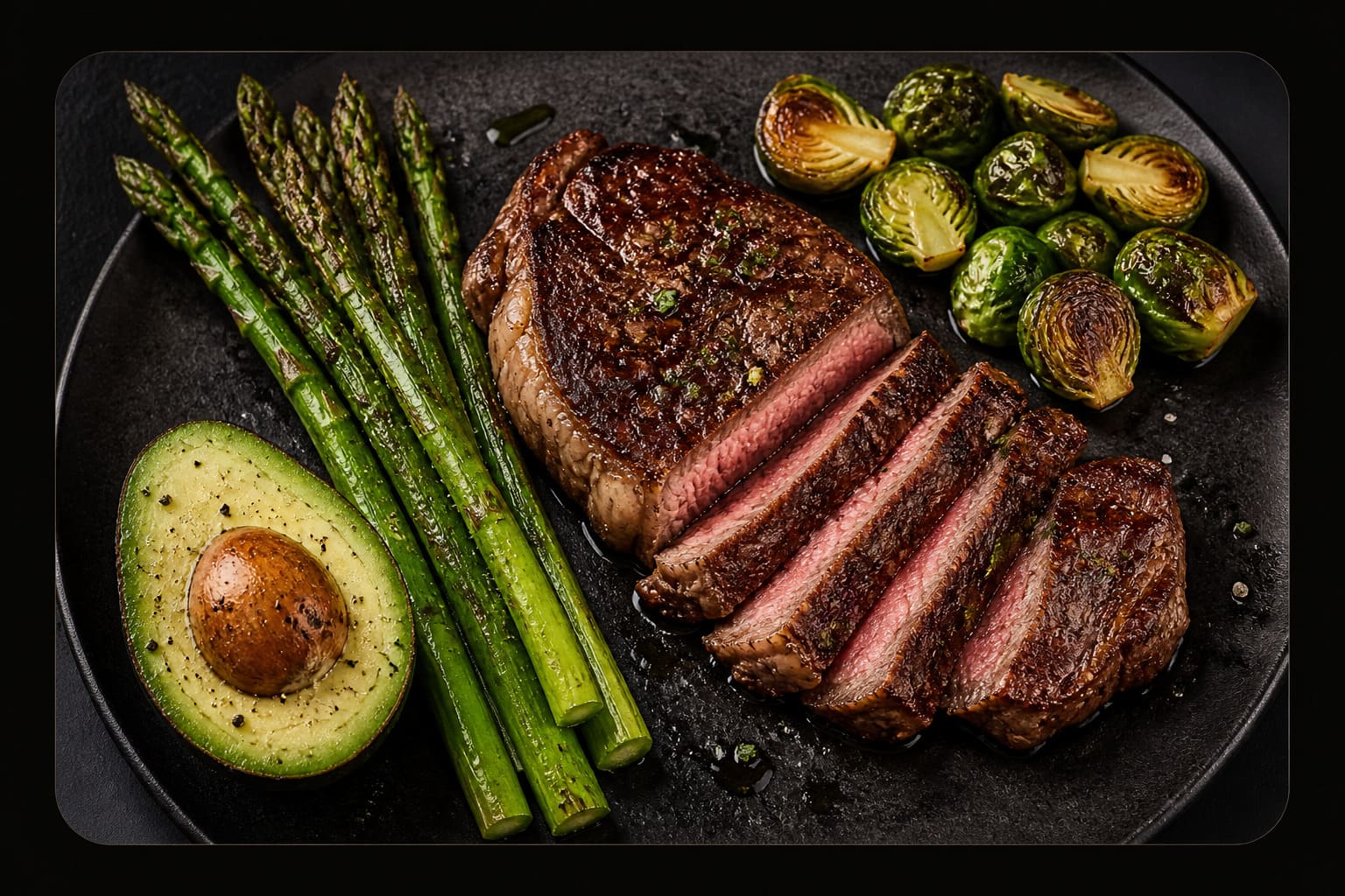
Carnivore
A simple animal-food reset used to remove guesswork and identify possible food triggers.
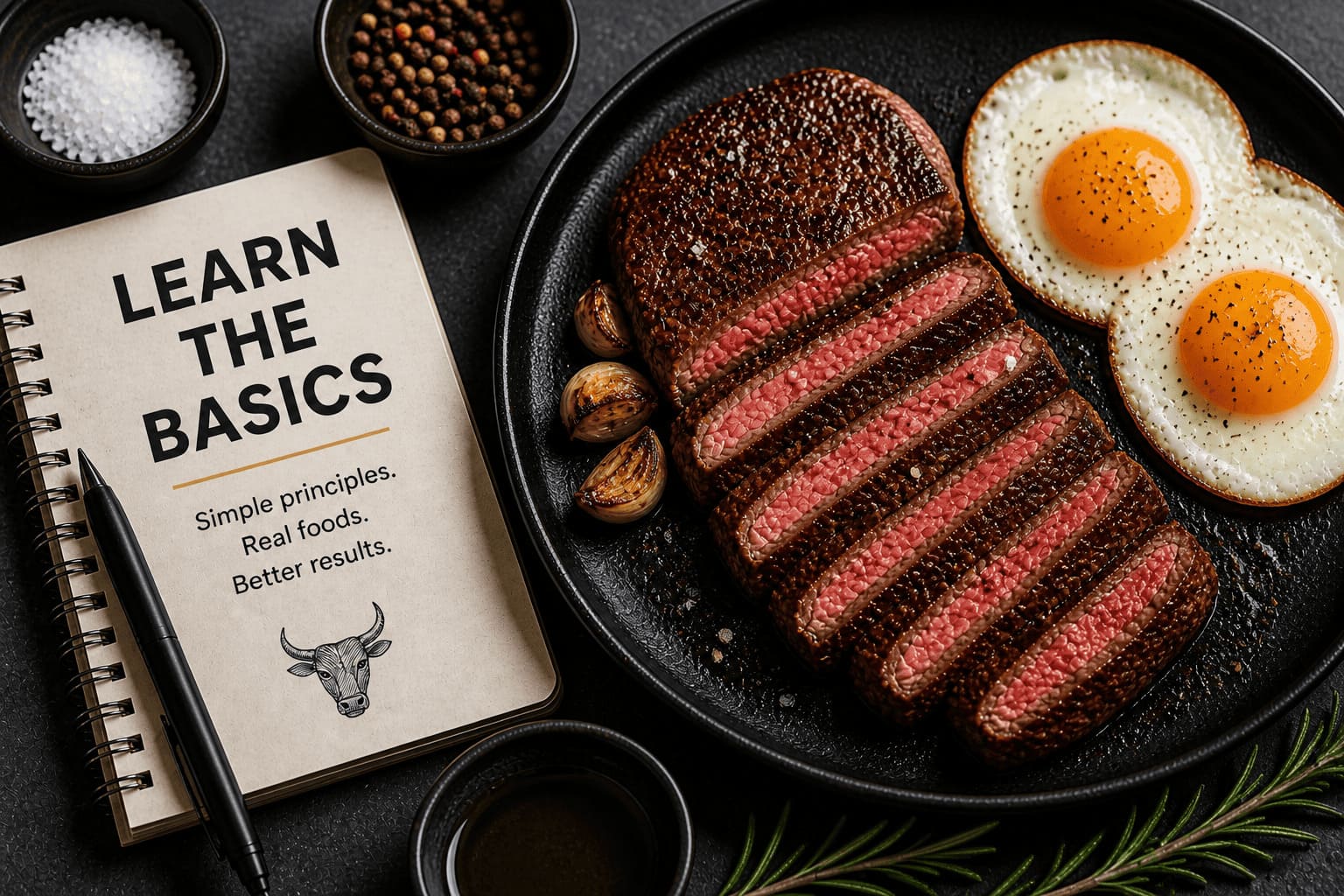
How KosherVore Works
Think of it as a simple path, not a strict diet label. You choose the level that works for your body and your life.
- Low-Carb: reduce sugar and starches.
- Keto: keep carbs lower and meals more structured.
- Ketovore: make meals meat-first with small extras.
- Carnivore: use animal foods as a reset or elimination tool.
Is This For You?
This guide section is for anyone who wants practical kosher low-carb eating without overcomplicating every meal.
- You want kosher low-carb meals that make sense.
- You want to understand low-carb, keto, ketovore, and carnivore clearly.
- You want simple recipes without non-kosher shortcuts.
- You want flexibility instead of another strict rulebook.
Start Simple. Stay Consistent.
Begin with low-carb, then move towards keto, ketovore, or carnivore only when it makes sense.
From Low-Carb to Carnivore, The Kosher Way
Simple food. Clear rules. No confusion.
KosherVore helps you keep the structure of kosher eating while using low-carb, keto, ketovore, and carnivore as practical tools.
- No meat and dairy mixing.
- No meat and fish mixing.
- No bacon, pork, shellfish, or non-kosher ingredients.
- Protein-first meals for real life.
Simple Kosher Recipes. No Confusion. Just Real Food.
Get practical kosher low-carb ideas, recipes, and guides straight to your inbox.
.kv-guides-page{
background:#0f0906;
color:#ffffff;
font-family:Arial, Helvetica, sans-serif;
line-height:1.7;
overflow:hidden;
margin:0 !important;
padding:0 !important;
}
.kv-guides-page *{
box-sizing:border-box;
}
.kv-wrap{
max-width:1180px;
margin:0 auto;
padding:0 22px;
}
.kv-center{
text-align:center;
}
.kv-narrow{
max-width:820px;
}
.kv-guides-hero{
padding:25px 0 70px;
margin-top:0 !important;
}
.kv-guides-hero h1{
font-size:56px;
line-height:1.08;
max-width:760px;
margin:0 auto 16px;
color:#ffffff;
}
.kv-guides-hero p{
max-width:720px;
margin:0 auto 35px;
color:#d8d8d8;
font-size:18px;
}
.kv-hero-img{
width:100%;
max-width:1040px;
height:330px;
object-fit:cover;
border-radius:18px;
display:block;
margin:0 auto;
box-shadow:0 18px 45px rgba(0,0,0,.28);
}
.kv-section{
padding:75px 0;
background:#0f0906;
}
.kv-section h2,
.kv-cta-section h2,
.kv-newsletter h2{
font-size:40px;
line-height:1.18;
margin:0 0 16px;
color:#ffffff;
}
.kv-section h3{
font-size:22px;
line-height:1.25;
margin:0 0 10px;
color:#ffffff;
}
.kv-section p,
.kv-cta-section p,
.kv-newsletter p{
color:#d8d8d8;
font-size:17px;
margin:0 0 18px;
}
.kv-sub{
max-width:760px;
margin:0 auto 36px !important;
}
.kv-grid-4{
display:grid;
grid-template-columns:repeat(4,1fr);
gap:22px;
margin-top:38px;
}
.kv-card{
background:#1b1b1b;
border:1px solid rgba(255,255,255,.08);
border-radius:18px;
overflow:hidden;
text-align:left;
box-shadow:0 14px 35px rgba(0,0,0,.22);
}
.kv-card img{
width:100%;
height:180px;
object-fit:cover;
display:block;
}
.kv-card-body{
padding:22px;
}
.kv-card-body p{
font-size:16px;
}
.kv-btn{
display:inline-block;
background:#d6a246;
color:#120b07 !important;
padding:12px 24px;
border-radius:40px;
font-weight:700;
text-decoration:none;
border:1px solid #d6a246;
margin-top:8px;
transition:.25s;
}
.kv-btn:hover{
opacity:.92;
transform:translateY(-2px);
}
.kv-btn-outline{
background:transparent;
color:#d6a246 !important;
margin-left:8px;
}
.kv-btn-outline:hover{
background:#d6a246;
color:#120b07 !important;
}
.kv-dark-box{
background:#151515;
border:1px solid rgba(255,255,255,.08);
padding:48px;
display:grid;
grid-template-columns:1fr 1fr;
gap:40px;
align-items:center;
}
.kv-list,
.kv-check-list{
list-style:none;
padding:0;
margin:24px 0 0;
}
.kv-list li,
.kv-check-list li{
position:relative;
padding-left:30px;
margin:12px 0;
color:#e5e5e5;
font-size:17px;
text-align:left;
}
.kv-list li:before,
.kv-check-list li:before{
content:”✓”;
position:absolute;
left:0;
color:#d6a246;
font-weight:700;
}
.kv-cta-section{
background:#151515;
padding:75px 0;
}
.kv-split-section{
background:#1a1a1a;
}
.kv-split{
display:grid;
grid-template-columns:1fr 1fr;
gap:50px;
align-items:center;
}
.kv-img{
width:100%;
border-radius:18px;
display:block;
object-fit:cover;
box-shadow:0 18px 45px rgba(0,0,0,.28);
}
.kv-newsletter{
background:#091006;
padding:75px 0;
}
.kv-newsletter h2{
max-width:760px;
margin-left:auto;
margin-right:auto;
}
.kv-newsletter-form{
max-width:780px;
margin:28px auto 0;
display:flex;
gap:14px;
align-items:center;
justify-content:center;
}
.kv-newsletter-form input{
flex:1;
min-width:0;
background:#11170d;
border:1px solid rgba(214,162,70,.35);
color:#ffffff;
padding:15px 18px;
border-radius:4px;
font-size:15px;
}
.kv-newsletter-form button{
background:#d6a246;
color:#120b07;
border:0;
padding:15px 24px;
border-radius:5px;
font-weight:700;
cursor:pointer;
}
body,
.site,
.site-content,
.ast-container,
.entry-content{
margin-top:0 !important;
padding-top:0 !important;
}
.entry-content > *:first-child{
margin-top:0 !important;
padding-top:0 !important;
}
@media(max-width:1050px){
.kv-grid-4{
grid-template-columns:repeat(2,1fr);
}
}
@media(max-width:900px){
.kv-guides-hero{
padding:20px 0 60px;
}
.kv-guides-hero h1{
font-size:42px;
}
.kv-hero-img{
height:280px;
}
.kv-dark-box,
.kv-split{
grid-template-columns:1fr;
}
.kv-section,
.kv-cta-section,
.kv-newsletter{
padding:60px 0;
}
}
@media(max-width:520px){
.kv-wrap{
padding:0 18px;
}
.kv-guides-hero{
padding:15px 0 55px;
}
.kv-guides-hero h1{
font-size:34px;
}
.kv-guides-hero p{
font-size:16.5px;
}
.kv-hero-img{
height:230px;
border-radius:14px;
}
.kv-grid-4{
grid-template-columns:1fr;
}
.kv-section h2,
.kv-cta-section h2,
.kv-newsletter h2{
font-size:30px;
}
.kv-dark-box{
padding:28px 20px;
}
.kv-newsletter-form{
flex-direction:column;
}
.kv-newsletter-form input,
.kv-newsletter-form button,
.kv-btn{
width:100%;
text-align:center;
}
.kv-btn-outline{
margin-left:0;
}
}